
Logo & Assets
The PPP logo comes in three lockups: a horizontal lockup (emblem on the left, single-line wordmark on the right), a vertical lockup (emblem above a three-line stacked wordmark), and a side-text lockup (emblem on the left, three-line stacked wordmark on the right). All come in two colour variants — black text for light backgrounds and white text for dark backgrounds — plus an emblem-only mark for small contexts where the wordmark would be illegible.
Use the horizontal lockup in wide spaces (headers, footers, email signatures, document headers), the vertical lockup where the space is tall or square (app splash, login cards, social avatars, badge art), and the side-text lockup in compact wide spaces where the horizontal wordmark would be illegibly small — such as the app sidebar header, where at 42px height the stacked lines stay readable while the single-line wordmark would render ~7px tall. The stacked wordmarks align the bold initial P of each word into a single "PPP" column.
Downloads
All files are available in SVG (vector) and three raster formats (PNG, JPG, WebP) generated on demand at high resolution. PPP staff can pick the format that fits their tool.

Full logo — black text
Use on white, light grey, and card backgrounds. Print, email signatures, documents.

Full logo — white text
Use on dark navy and brand-blue backgrounds. Headers, footers, dark hero sections.
Vertical logo — black text
Emblem stacked over a three-line wordmark. Use on white/light backgrounds where the space is tall or square — app splash, login cards, badge art.
Vertical logo — white text
Vertical lockup for dark navy and brand-blue backgrounds — dark hero panels, splash screens, avatars.

Side-text logo — black text
Emblem beside a three-line stacked wordmark. Use on white/light backgrounds in compact wide spaces — app sidebar header, toolbars.

Side-text logo — white text
Side-text lockup for dark navy and brand-blue backgrounds — dark headers and toolbars.

Emblem only
Favicon, app icon, avatars, and any context under ~40px wide where the wordmark would be illegible.
SVG is the master format — vector, infinitely scalable, and colour-accurate. The PNG/JPG/WebP downloads are generated client-side by rasterising the SVG into a canvas at 2048px wide (1024px for the square emblem) and encoding it to the requested format. JPG fills transparent pixels with white because JPG has no alpha channel.
Logo construction
Horizontal lockup
┌─────────────────────────────────────────────────┐
│  [Emblem]   Professional Performance Portfolio  │
│  100×97px   ← 17px gap →  Nunito, 27px          │
└─────────────────────────────────────────────────┘
  Total canvas: 572 × 97 px
Vertical lockup
┌──────────────────────┐
│       [Emblem]       │
│       100×97px       │
│   ← 22px gap →       │
│   Professional       │
│   Performance        │   Nunito, 30px, left-aligned
│   Portfolio          │   bold initial P aligns into a "PPP" column
└──────────────────────┘
  Total canvas: 216 × 238 px
Side-text lockup
┌───────────────────────────────────┐
│  [Emblem]      Professional       │
│  100×97px      Performance        │   Nunito, 30px, left-aligned
│  ← 17px gap →  Portfolio          │   bold initial P aligns into a "PPP" column
└───────────────────────────────────┘
  Total canvas: 290 × 106 px
Derived 1:1 from the vertical lockup (#10151): same embedded Nunito subset and emblem PNG, the horizontal lockup's 17px emblem→wordmark gap, and the vertical lockup's 30px/40px line rhythm — the emblem is vertically centred against the three-line stack.
Emblem — a blue circular badge (#117BE5) with a stylised chart/line graphic in white. The chart is stored as an embedded PNG inside the SVG file for rendering fidelity across browsers.
Wordmark — set in Nunito (Google Fonts), the PPP brand typeface (Brand Guidelines v1.0). The initial P of each word (Professional, Performance, Portfolio) is font-weight: 700; the remainder of each word is font-weight: 400. This creates a typographic rhythm that echoes the "PPP" abbreviation — and in the vertical lockup the three bold P's stack into a single column. The Nunito subset (400 + 700, wordmark glyphs only) is embedded in each SVG as a base64 @font-face so the mark renders identically everywhere without a network font fetch.
<tspan font-weight="700">P</tspan><tspan font-weight="400">rofessional </tspan>
<tspan font-weight="700">P</tspan><tspan font-weight="400">erformance </tspan>
<tspan font-weight="700">P</tspan><tspan font-weight="400">ortfolio</tspan>
Wordmark colour
- Light backgrounds →
#1B1B1B(baseText) — useppp-full-black-text-v1.svg(horizontal),ppp-vertical-black-text-v1.svg(vertical), orppp-side-black-text-v1.svg(side-text) - Dark backgrounds →
#FFFFFF— useppp-full-white-text-v0.svg(horizontal),ppp-vertical-white-text-v1.svg(vertical), orppp-side-white-text-v1.svg(side-text)
Logo rules
- Minimum height: 34px (footer) / 42px (header)
- Background pairing: always match text colour to background — black text on light, white text on dark/navy
- Font: Nunito only — never substitute another typeface for the wordmark
- Clear space: maintain a margin equal to the height of the emblem "P" letterform on all four sides of the lockup
- Do not: recolour the emblem, stretch or skew the lockup, add drop shadows, or rearrange the emblem/wordmark order
- Emblem-only use: acceptable at sizes below ~40px wide where the wordmark would become illegible
Background usage guide
| Background | Recommended asset |
|---|---|
White (#FFFFFF, #F9FAFB) | ppp-full-black-text-v1.svg |
Light grey / card (#F4F5F7, #FBFBFF) | ppp-full-black-text-v1.svg |
Dark navy (#151D28) | ppp-full-white-text-v0.svg |
Brand blue (#117BE5) | ppp-full-white-text-v0.svg |
| Photography / complex backgrounds | Emblem only (ppp-emblem-v0.svg) |
Logo do's & don'ts
| ✓ Do | ✗ Don't |
|---|---|
| Use the supplied logo files exactly as provided. | Recreate, redraw, or trace the logo manually. |
| Place on navy, brand blue, white, or pale-grey backgrounds. | Place on red/green/yellow or busy photographic backgrounds. |
| Maintain the full clear space around the mark. | Crowd the logo with text, icons, or other graphics. |
| Scale the logo proportionally. | Stretch, squash, skew, or rotate the logo. |
| Use the white-text variant on dark surfaces. | Apply drop shadows, gradients, glows, or strokes to the mark. |
| Keep the emblem in the approved brand blue. | Re-colour the logo to match a partner brand or seasonal theme. |
Co-branding and partner logos
When PPP appears alongside partner organisations (CSIRO, AHPRA, AMC, Queensland Children's Hospital, etc.), align all logos to the same optical height — not the same pixel height. Logos with descenders or wider lockups need slight adjustment. Separate logos with a thin vertical rule in brand grey, and never imply endorsement that has not been formally agreed.
Partner/support logos live in instances/marketing/public/assets/support-*.svg — see Components → Partner / support logos for the file list. Always display them on white/light backgrounds and never recolour them.
Mobile app icon
The PPP mobile app icon places the white emblem on the primary blue background, cropped to the platform's native squircle (iOS) or rounded-square (Android) mask. The home screen label reads PPP — this is set by the OS from the App Store / Play Console app name, never baked into the artwork.
Critical rule — blue fills the canvas
Do: let the blue emblem background fill the full squircle. This is clear, distinct brand identity and matches how the emblem is defined.
Don't: float the emblem on a white or neutral icon background. It loses brand identity and looks generic.
Platform sizes
| Platform | Primary size | Additional sizes | Source |
|---|---|---|---|
| iOS | 1024 × 1024 px | 180, 167, 152, 120, 87, 80, 60, 40, 29 px | instances/ppp/public/ppp-emblem-v0.svg |
| Android | 512 × 512 px (Play) | 192, 144, 96, 72, 48 px | app.json → expo.android.adaptiveIcon |
Generate all sizes from the master 1024 × 1024 px PNG rendered from the emblem SVG. Both platforms apply their own mask on top, so submit a full square canvas — don't pre-round corners in the artwork.
Safe zone
Keep the emblem graphic within the central 82% of the canvas. The outer 9% on each edge may be clipped by platform masks or covered by home-screen shadows and badges.
PPP Provider Accreditation Badge
The AMC does not issue accreditation badges to CPD Homes (confirmed 18 May 2026). PPP creates its own badge to grant to external content providers whose CPD resources it has vetted and approved — analogous to what other AMC CPD Homes do for their accredited providers.
What it is
A horizontal pill badge: the PPP emblem (unmodified) on the left, "PPP ACCREDITED / CPD PROVIDER" text on the right. Comes in two variants:
| Variant | Use on |
|---|---|
| Light | White and light-grey backgrounds (emails, PDFs, web pages) |
| Dark | Navy and dark-hero backgrounds |
Email footer usage
The provider notification email (#5970) currently displays a text-only "Verify our accreditation" link (→ PPP's AMC listing) in the footer. Once the badge PNG is approved (#6167) and dropped into the email-assets path (#6281), the badge will display alongside this link. The email gracefully degrades to text-only until then.
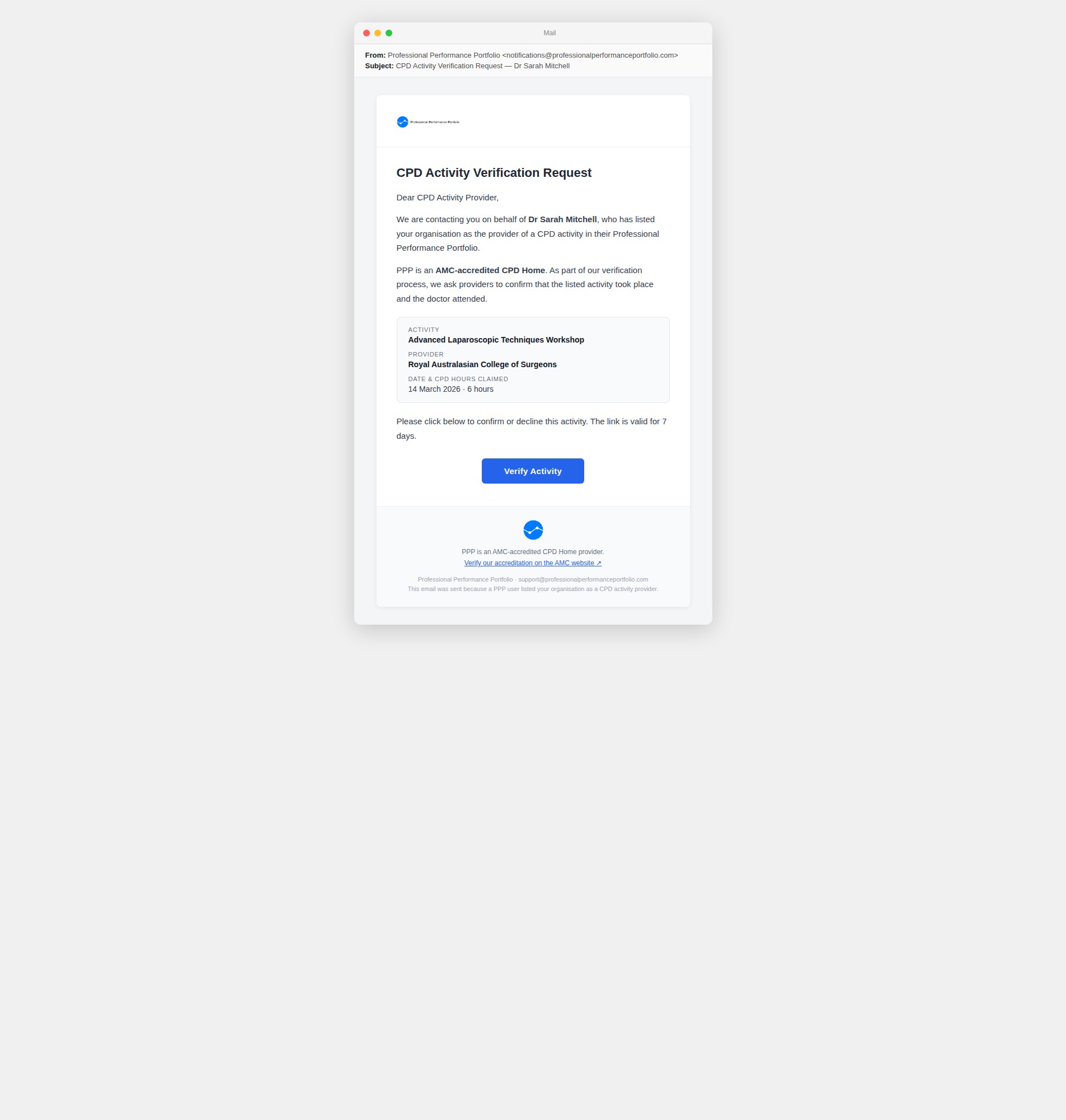
Above: the provider notification email as it appears to a CPD activity provider. The footer "Verify our accreditation on the AMC website" link is live. The badge will appear above this link once #6167 is resolved.
Badge downloads
Provider badge — light
Use on white and light-grey backgrounds (emails, PDFs, web pages). 180 × ~40 px display size.

Provider badge — dark
Use on navy and dark-hero backgrounds. 180 × ~40 px display size.
Design status
- Design: approved — #6167 (horizontal pill, light + dark, design session 19 May 2026)
- Engineering wiring: #6281 (enable
EMAIL_AMC_BADGE_ENABLEDflag in Doppler once tested)
Rules
- The PPP emblem must appear unmodified — no recolouring, cropping, or SVG recreation
- The badge is granted only to providers vetted by PPP — it is not a general-use asset
- Do not use the badge to imply AMC endorsement; it signals PPP vetting, not AMC certification
Product imagery
The laptop and phone images in the marketing website's hero, plus the plain screens and empty device frames they are built from. Use them for social posts, videos and presentations that should match the website.
The mockups are made by instances/marketing/scripts/composite-device-shells.mjs, which pastes a real capture of the product (from scripts/capture-product-screenshots.mjs) into each device frame. When the hero changes, re-run both scripts and copy the new files here in the same PR.
Resolution: these are web-sized. The phone screen is 345 px wide, so it looks soft when scaled up to fill a video frame. Ask for a fresh capture at double resolution if you need sharper images.
Hero mockups
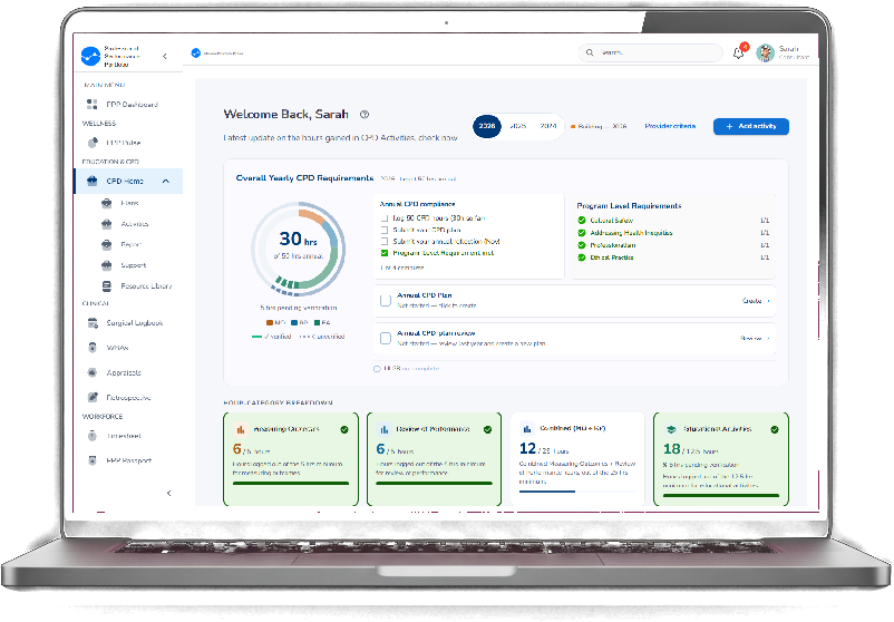
Hero laptop
The laptop image exactly as shown in the website hero. Transparent background. 802 × 558 px.
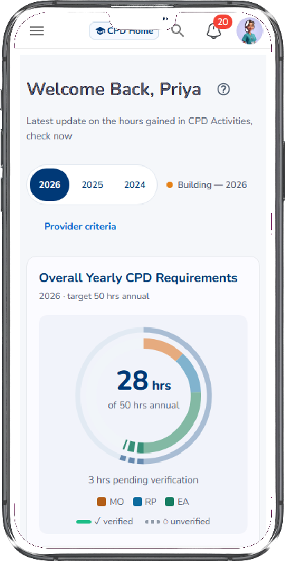
Hero phone
The phone image exactly as shown in the website hero. Transparent background. 411 × 809 px.
Plain screens
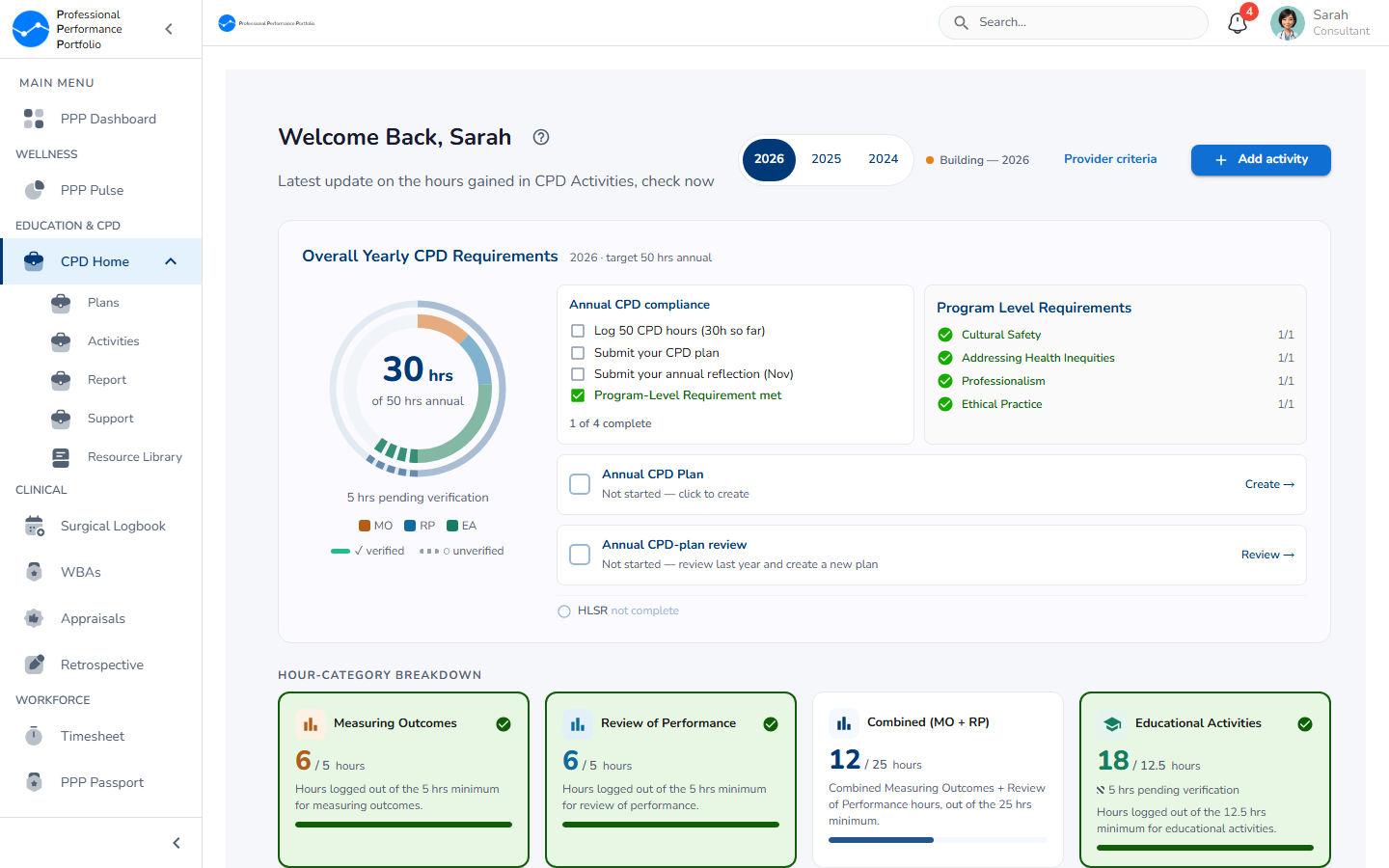
Desktop screen
The CPD Home screen used in the hero laptop, without the frame. 1440 × 900 px.

Phone screen (full page)
The CPD Home screen used in the hero phone, as one tall image of the whole page. Useful for scrolling shots. 345 × 2761 px.
Empty device frames
The frames have a bright magenta screen so an editor can key it out and drop in any screen.
Empty laptop frame
Laptop frame with a magenta screen for compositing. 1024 × 1024 px.
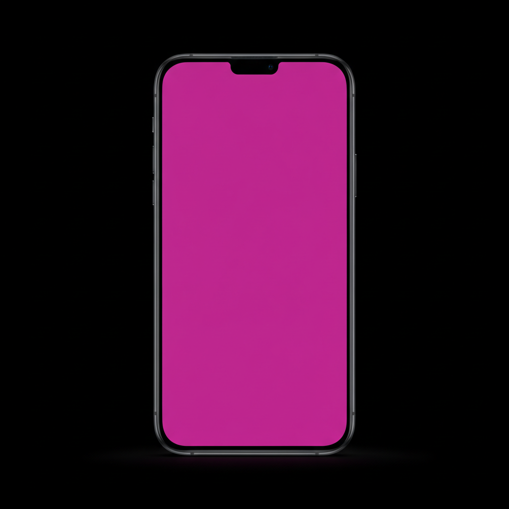
Empty phone frame
Phone frame with a magenta screen for compositing. 1024 × 1024 px.
Asset source paths
Production SVG sources live in instances/ppp/public/ alongside other static frontend assets. The docs site's /brand/assets/ files under docs/site/public/brand/assets/ are byte-identical copies kept in sync for embedding in these docs.
| Asset | Production path | Docs path |
|---|---|---|
| Full logo — black text | instances/ppp/public/ppp-full-black-text-v1.svg | /brand/assets/ppp-full-black-text-v1.svg |
| Full logo — white text | instances/ppp/public/ppp-full-white-text-v0.svg | /brand/assets/ppp-full-white-text-v0.svg |
| Vertical logo — black text | instances/ppp/public/ppp-vertical-black-text-v1.svg | /brand/assets/ppp-vertical-black-text-v1.svg |
| Vertical logo — white text | instances/ppp/public/ppp-vertical-white-text-v1.svg | /brand/assets/ppp-vertical-white-text-v1.svg |
| Side-text logo — black text | instances/ppp/public/ppp-side-black-text-v1.svg | /brand/assets/ppp-side-black-text-v1.svg |
| Side-text logo — white text | instances/ppp/public/ppp-side-white-text-v1.svg | /brand/assets/ppp-side-white-text-v1.svg |
| Emblem only | instances/ppp/public/ppp-emblem-v0.svg | /brand/assets/ppp-emblem-v0.svg |
| Favicon 32px | instances/ppp/public/favicon-32x32.png | — |
| Favicon 16px | instances/ppp/public/favicon-16x16.png | — |
| Apple touch icon | instances/ppp/public/apple-touch-icon.png | — |
| Provider badge — light (2×) | instances/ppp/public/email-assets/ppp-provider-badge-light.png | /brand/assets/ppp-provider-badge-light.png |
| Provider badge — dark (2×) | instances/ppp/public/email-assets/ppp-provider-badge-dark.png | /brand/assets/ppp-provider-badge-dark.png |
| Hero laptop | instances/marketing/public/assets/glass/devices/laptop-device.png | /brand/assets/product/laptop-device.png |
| Hero phone | instances/marketing/public/assets/glass/devices/phone-device.png | /brand/assets/product/phone-device.png |
| Desktop screen | instances/marketing/public/assets/glass/devices/laptop-ppp-home.png | /brand/assets/product/laptop-ppp-home.png |
| Phone screen (full page) | instances/marketing/public/assets/glass/devices/mobile-cpd-home.png | /brand/assets/product/mobile-cpd-home.png |
| Empty laptop frame | instances/marketing/public/assets/glass/devices/shell-laptop.png | /brand/assets/product/shell-laptop.png |
| Empty phone frame | instances/marketing/public/assets/glass/devices/shell-phone.png | /brand/assets/product/shell-phone.png |